Useful StackOverflow link:
https://stackoverflow.com/questions/28496809/wpf-flexible-tabcontrol-header
Step 1: Create a new WPF application
Step 2: Create an example adjustable window with tab items
Update the MainWindow.xaml to create a grid with a column section containing the tab items and a grid splitter to adjust the width of the tab item area.
MainWindow.xaml
We will get on to the step of creating the tab control style in a minute…
<Window x:Class="TabItemResize.MainWindow"
        xmlns="http://schemas.microsoft.com/winfx/2006/xaml/presentation"
        xmlns:x="http://schemas.microsoft.com/winfx/2006/xaml"
        xmlns:d="http://schemas.microsoft.com/expression/blend/2008"
        xmlns:mc="http://schemas.openxmlformats.org/markup-compatibility/2006"
        mc:Ignorable="d"
        Title="MainWindow" Height="450" Width="700">
    <Grid>
        <Grid.ColumnDefinitions>
            <ColumnDefinition Width="Auto" />
            <ColumnDefinition Width="5" />
            <ColumnDefinition Width="Auto" />
        </Grid.ColumnDefinitions>

        <TabControl Style="{DynamicResource TabControlStyle}"  >
            <TabItem Header="Tab no. 1" />
            <TabItem Header="Tab no. 2" />
            <TabItem Header="Tab no. 3" />
        </TabControl>

        <GridSplitter
            Grid.Column="1"
            ResizeDirection="Columns"
            HorizontalAlignment="Stretch"
            VerticalAlignment="Stretch" />
    </Grid>
</Window>
Step 3: Create a version of UniformGrid
UniformTabPanel.cs
Notice the override to obtain the Size object that is governed by the total width of the child TabItems:
using System.Linq;
using System.Windows;
using System.Windows.Controls;
using System.Windows.Controls.Primitives;

namespace TabItemResize
{
   public class UniformTabPanel : UniformGrid
   {
      public UniformTabPanel()
      {
         IsItemsHost = true;
         Rows = 1;
         HorizontalAlignment = HorizontalAlignment.Stretch;
      }

      protected override Size MeasureOverride(Size constraint)
      {
         var totalMaxWidth = Children.OfType<TabItem>().Sum(tab => tab.MaxWidth);
         if (!double.IsInfinity(totalMaxWidth))
            HorizontalAlignment = constraint.Width > totalMaxWidth
               ? HorizontalAlignment.Left
               : HorizontalAlignment.Stretch;

         return base.MeasureOverride(constraint);
      }
   }
}
Step 4: Create the style for the TabControl
App.xaml
<Application x:Class="TabItemResize.App"
             xmlns="http://schemas.microsoft.com/winfx/2006/xaml/presentation"
             xmlns:x="http://schemas.microsoft.com/winfx/2006/xaml"
             xmlns:local="clr-namespace:TabItemResize"
             StartupUri="MainWindow.xaml">
    <Application.Resources>
        <Style x:Key="TabControlStyle" TargetType="{x:Type TabControl}">
            <Setter Property="SnapsToDevicePixels" Value="True" />
            <Setter Property="Template">
                <Setter.Value>
                    <ControlTemplate TargetType="{x:Type TabControl}">
                        <Grid>
                            <Grid.RowDefinitions>
                                <RowDefinition Height="Auto" />
                                <RowDefinition Height="*" />
                            </Grid.RowDefinitions>

                            <Border>
                                <local:UniformTabPanel x:Name="HeaderPanel" />
                            </Border>

                            <Border x:Name="Border" Grid.Row="1"
                                    BorderThickness="{TemplateBinding BorderThickness}"
                                    Background="{TemplateBinding Background}"
                                    BorderBrush="{TemplateBinding BorderBrush}">
                                <ContentPresenter x:Name="PART_SelectedContentHost" ContentSource="SelectedContent" />
                            </Border>
                        </Grid>
                    </ControlTemplate>
                </Setter.Value>
            </Setter>
        </Style>
    </Application.Resources>
</Application>
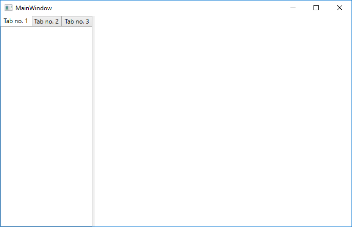
On running the application see that the default widths of the tab items are displayed:
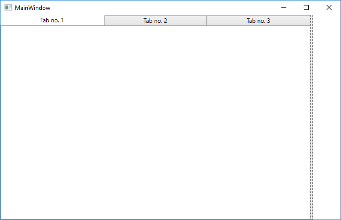
And dragging across the splitter control the widths of the tab headers are expanded accordingly: